
Summary
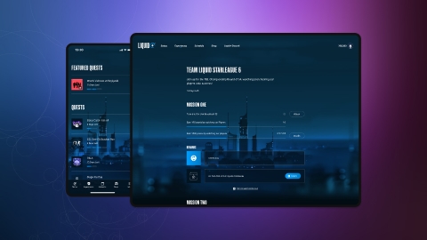
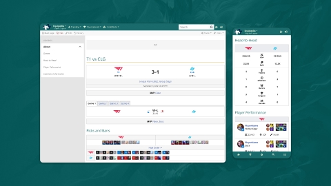
In the early 2010s, esports ‘rapid’ growth strained Team Liquid’s ability to build and maintain products. Poor product usability and scalability, slower time to value, and design/technical debt were all common.
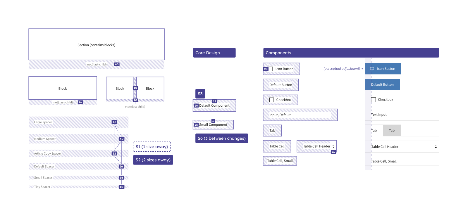
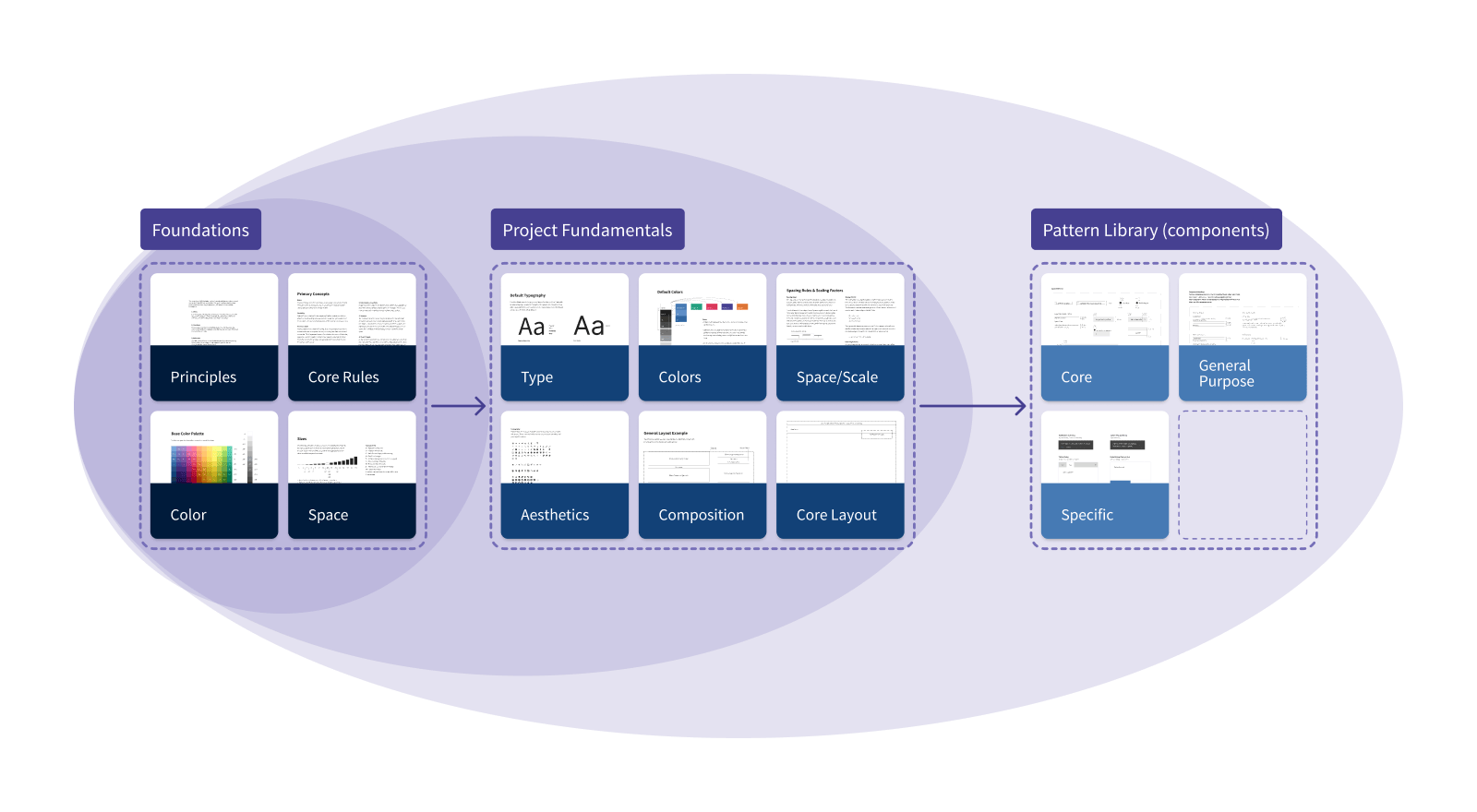
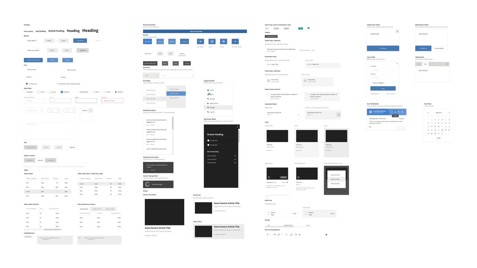
Project Chaos was created to address these challenges, and I led the design and development of a flexible, accessible, and performance-focused design system that improved the user and product experience across major projects.
Key Outcomes
- Design to Development times reduced by up to 400%.
- System usability increased by ~2.5x.
- Projects nearly 100% WCAG AA compliant (a 35% increase).
- Bundle sizes reduced by almost half.
Highlighted Methods
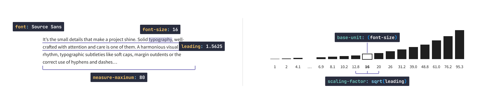
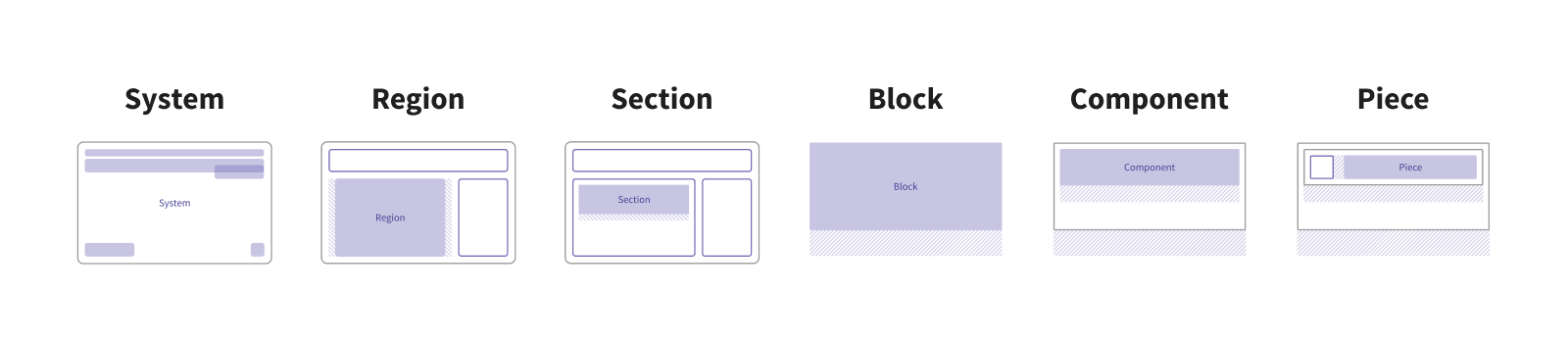
Competitive analysis, accessibility research, UI audits, systems design