Summary
Team Liquid wanted to build a stronger relationship with fans, converting that affinity into a measurable relationship and in a way that managed financial risks. But this led to a complex valuation framework that would be difficult for fans to understand and use on their own.
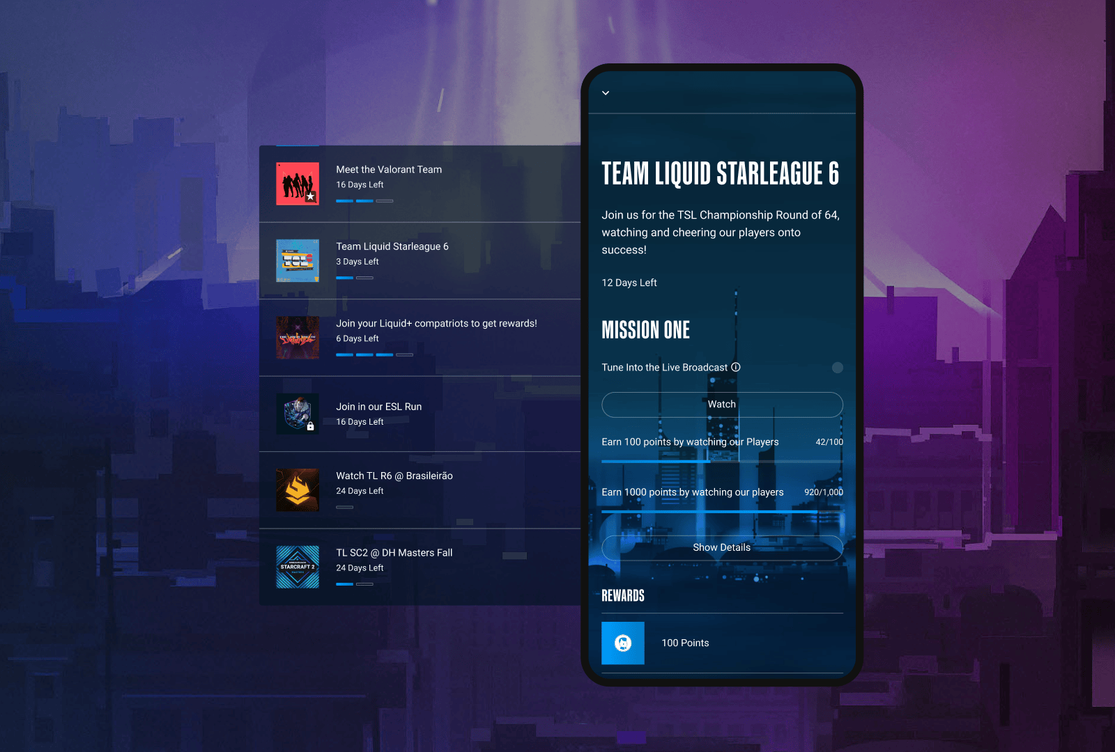
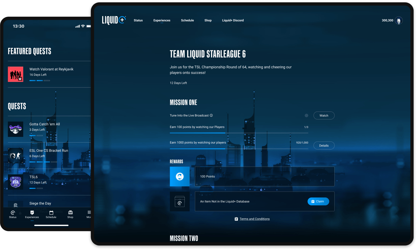
Quests were designed to solve all of these challenges, and I led the design efforts from its conception through its 2nd version, building an experience that helped drive fan engagement and helped fans learn how to build value for themselves.
Key Outcomes
- Over 100K users joined the platform in the first year.
- Fan activation rate was 70%, and retention was 99%.
- Engagement on digital platforms increased up to 150%.
- More than 1.6B points were earned by fans, with 12+ users reaching the 1M point milestone.
Highlighted Methods
Market research, user stories, information architecture, wireframing, user interviews/feedback/testing, preference testing