Summary
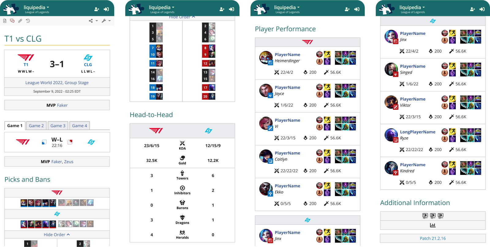
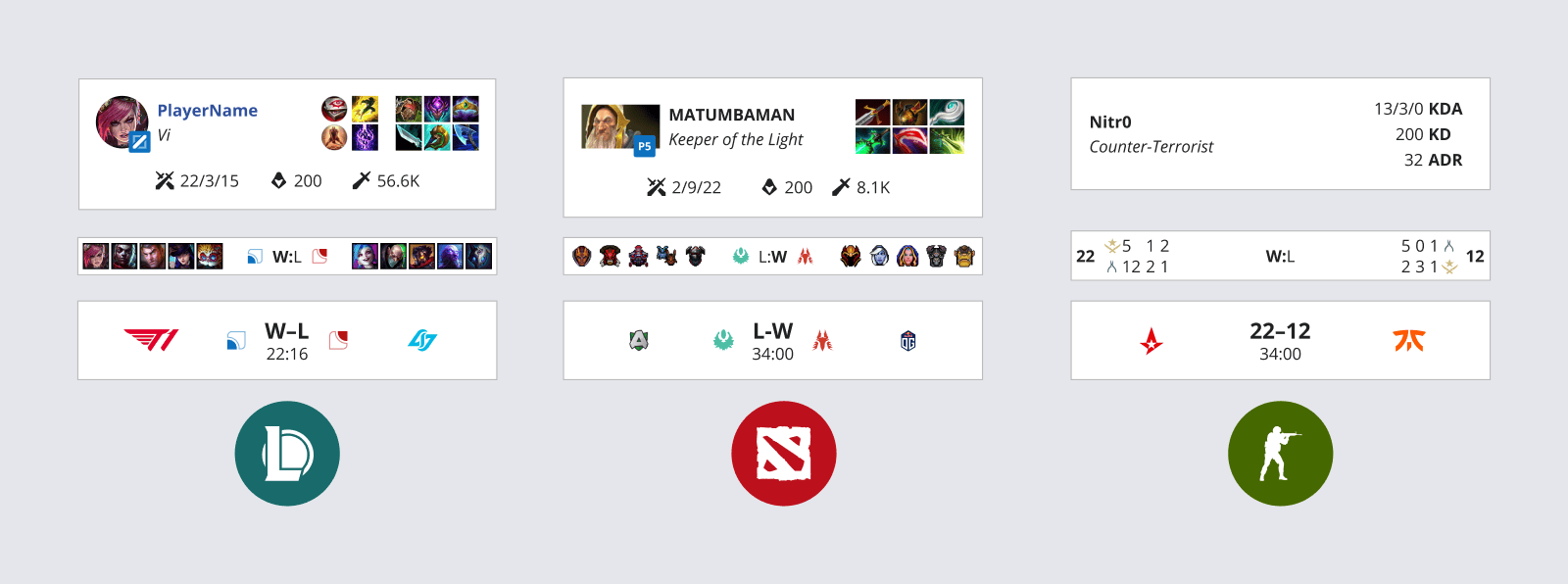
When Leaguepedia lost its primary contributor in 2021, it created an opportunity for Liquipedia to improve its position within the League of Legends community by closing the gap between the two resources.
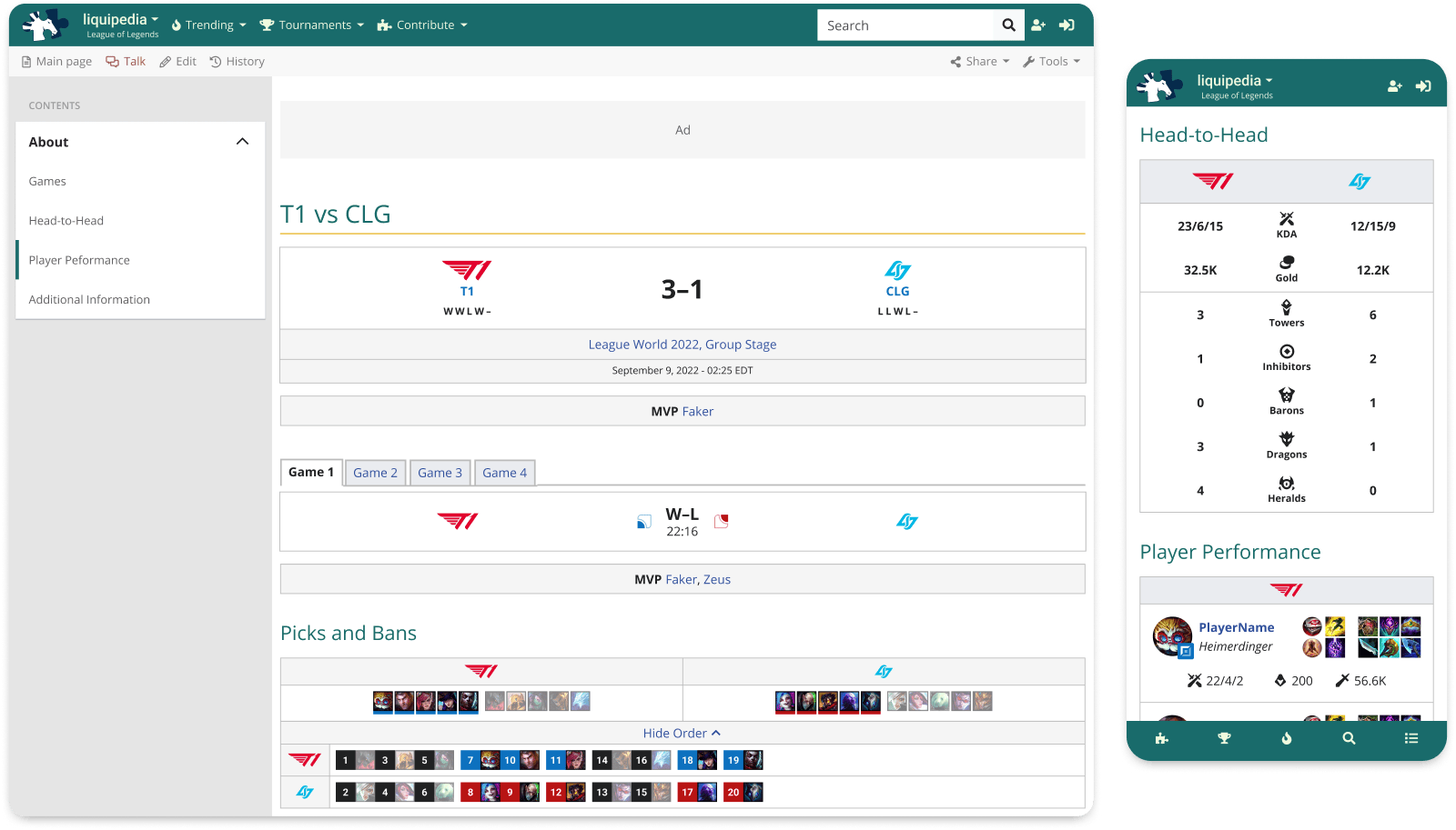
I collaborated with the team to design a new match page experience, improving visibility and user engagement by providing more robust information in an highly usable and accessible format.
Outcomes
Match pages launched after I left Team Liquid. However, the team was excited about testing with users, and the page is steadily used by community editors and fans today.
Highlighted Methods
Market research, data/sentiment analysis, user flows, information architecture, wireframing, preference testing