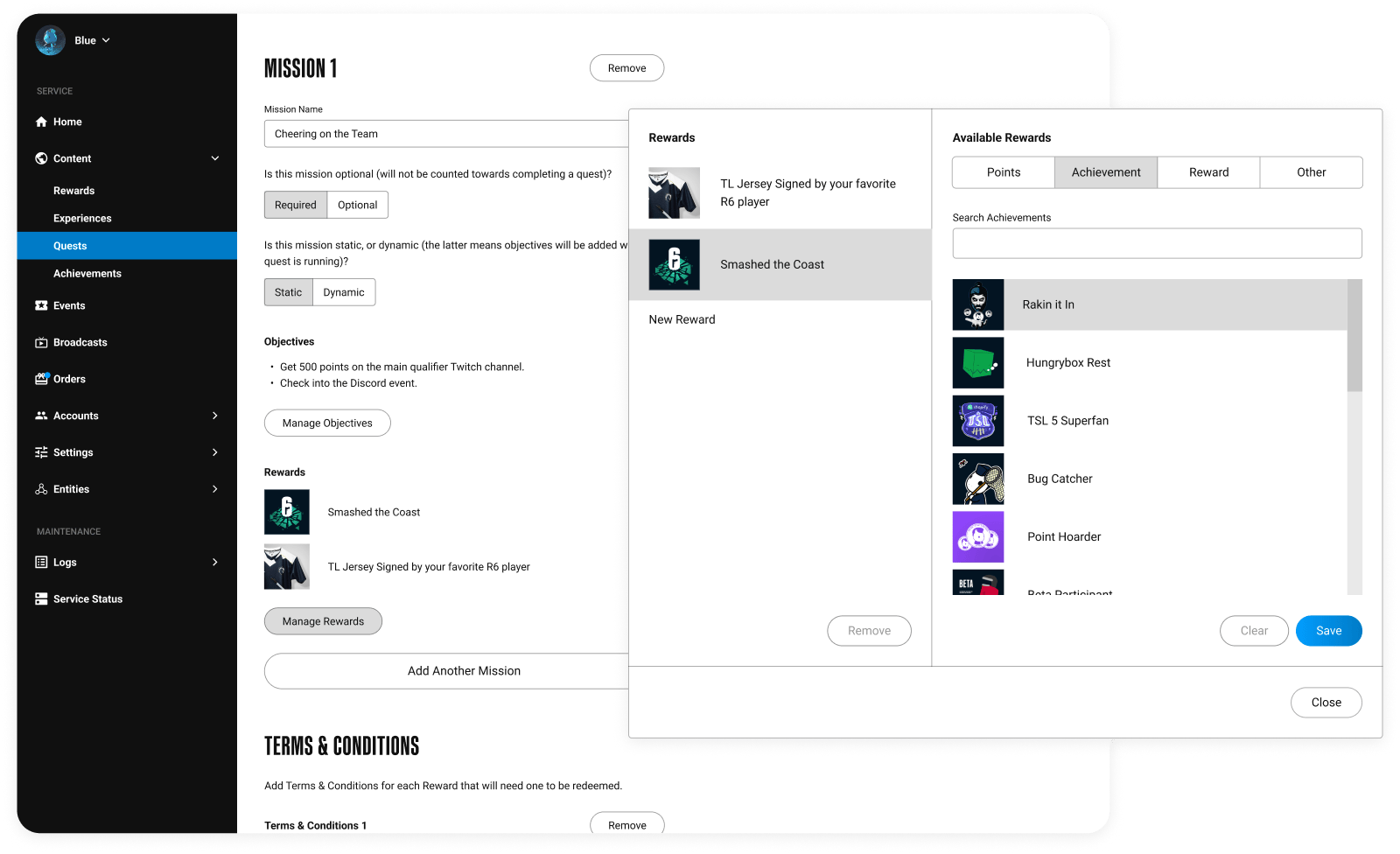
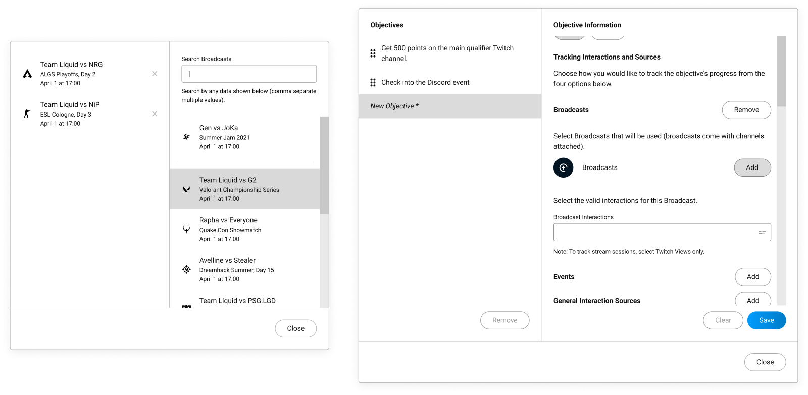
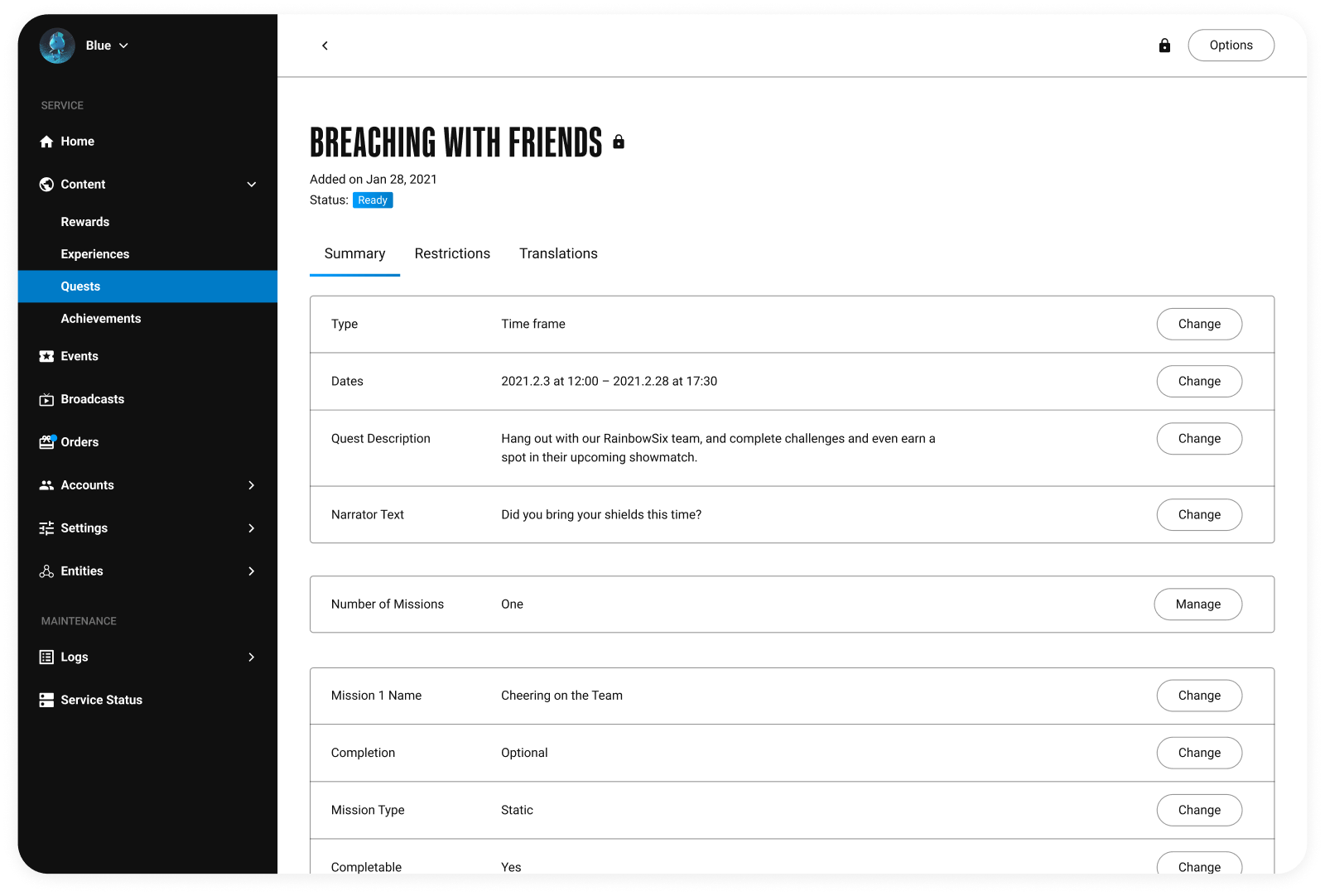
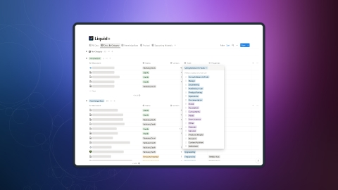
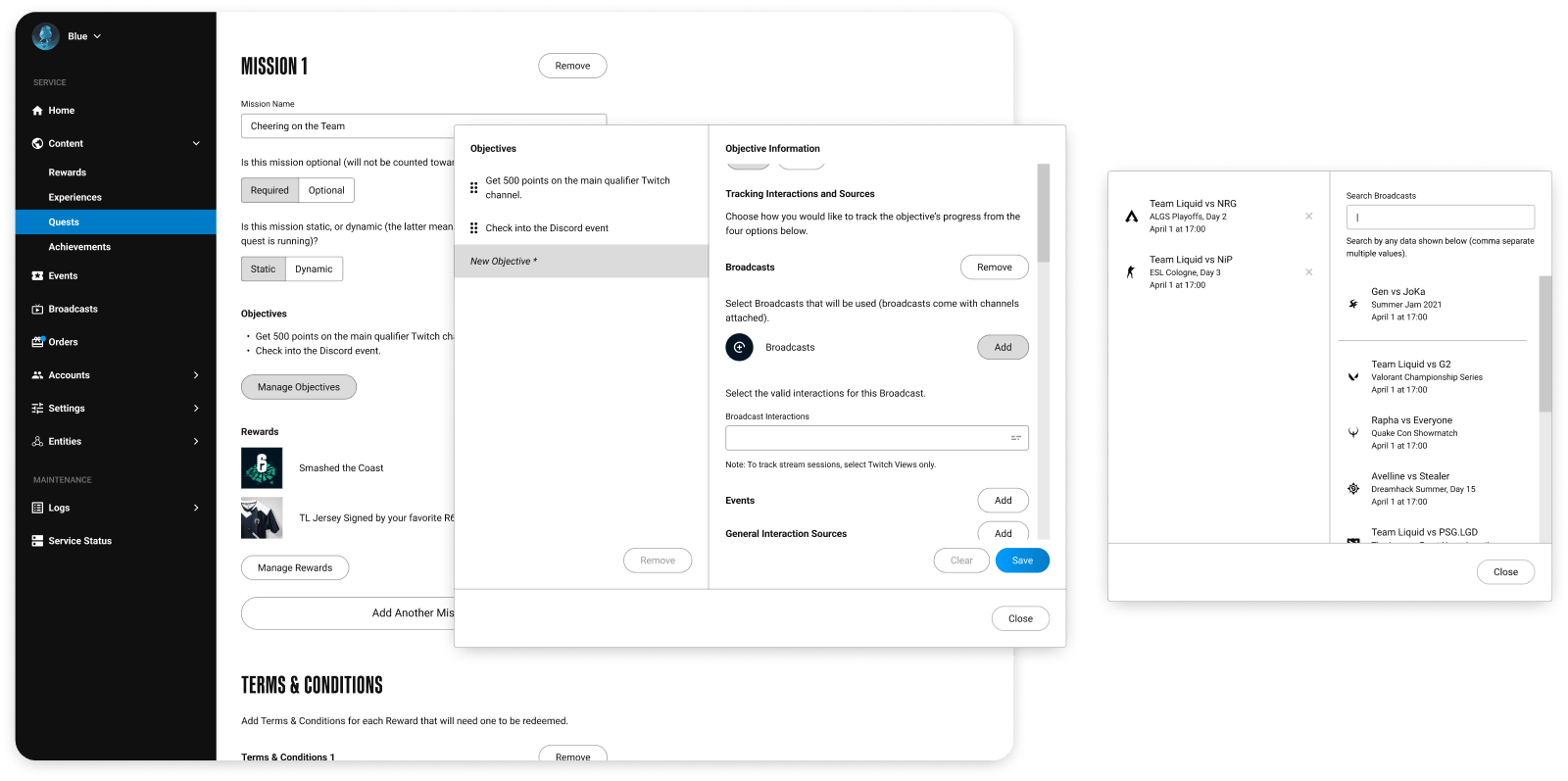
Liquid+ Quest Management

Helping Staff Manage Complexity to Create a Better Fan Experience

Projected Impact

  • Task completion times decrease by ~10–20%.
  • Customer effort reduce by up to 70%.
  • Errors drop by ~80–90% when adding Broadcasts.
Table of Contents
  1. Introduction
    1. Preserving the Time for Creativity
    2. Defining Smaller Opportunities
  2. Design(ing) Challenges
    1. Using "Attachments" to Focus and Speed Up the User Journey
    2. Transforming Quest Objectives Using Disclosure and Conversation
  3. The Results
    1. Providing Better Impact with Adjustments
    2. More Improvements can Still be Made
    3. Learning to Balance Future Thinking with Speed

Introduction

Preserving the Time for Creativity

People who make content professionally often have to handle a lot of things: creating content, driving project alignment in team settings, managing customer relationships, and creating strategies around how to reach and make an impact on people. This makes their time a valuable resource, and not something they want to waste.

Content managers fill all of these roles with Liquid+. But their biggest role is helping to ensure that there are plenty of opportunities for fans to engage with Team Liquid. And central to that effort is managing the core feature that drives engagement on the platform. Quests.

The fan-facing design for Quests, showing the challenges and rewards available.

Quests help fans build value for themselves by contextualizing what success looks like. They offer unique challenges and rewards for their completion. And they can be configured in a lot of ways to sustain interest over time. But these details also creates a highly complex piece of content that would be incredibly challenging to manage if not designed carefully.

So when I began working on the management experience for Liquid+, the biggest challenge I had was

how do we simplify the complexity of Quests to help content managers focus on the most important parts of their job?

Defining Smaller Opportunities

At a more practical level, because of how Quests began to develop several opportunities existed to help staff minimize work and create Quests more quickly and with more confidence:

  • Complexity needed to be broken down to help staff understand what context they were in, and what goals they could achieve for that context.
  • Because of its modular nature, keeping a user in context for similar activities was a big opportunity for clarity and saving time.
  • Disclosure would likely be needed to help manage the branching complexity that existed, helping users focus on specific tasks.
  • The idea of attachments existed all over the CMS, so normalizing this capability around a tight set of functional ideas would help staff acclimate faster.
  • Learning to be successful without needing ‘secret knowledge’ was an important outcome.

Employing or solving these pieces would have a major effect on what the eventual solution looked like, and drive the success we wanted to see.

Design(ing) Challenges

Being that Liquid+ is a hybrid engagement and loyalty service, the most complex part of Quests for staff was in creating and managing challenges for fans; what we called Objectives. Objectives are were staff

  • define goals;
  • connect to external services to collect and track progress of those goals.
  • set conditions for how these goals would be met; and

And I understood pretty early on that they were critical to get right. But there were lots of questions around how to do that in a way that maximized clarity and efficiency. And working through them would be challenging, especially as I couldn’t ask the content team about their needs (as they didn’t exist yet).

So I had to use my best judgement as I worked through the problem, keeping my eye on how solutions would optimize the opportunities we had.

Using "Attachments" to Focus and Speed up the User Journey

One of the bigger challenges with designing content for management is how to organize information into clear and understandable themes: “what is a logical piece of content to a user?”, or “when is a collection of tasks part of a larger group?”

Objectives were a fairly clear “package” to design around. And this aligned with a capability we wanted early on: being able to “attach” content to other pieces of content.

The architectural design of Objects in the CMS, showing how the attachment concept could be used to help manage these objects more easily.

However, it wasn’t entirely clear if treating Objectives as an attachment (a separate piece of content) would lead to the best outcome.

Attachments had a few benefits. It was the most flexible approach for organizing pieces of content together (👍🏻1), and it enabled a serialized approach to attaching similar pieces of content (a major speed benefit 👍🏻2). But treating Objectives as attachments also had one big downside: it would be difficult to remember what Objectives belonged to what Quest, making the process of building a Quest a lot more complicated (👎🏻3).

The two possible user flows for objectives — the second version being much simpler.

Because of the downside, I decided work with a more straightforward approach and keep Objectives contained within Quests. Choosing this route however made it pretty clear that I was going to need a separate context of some kind to address the informational complexity, usability, and speed challenges that it was going to create.

This is where my idea to create a Staging Dialog began.

Creating a Staging Area for Creation and Attachment

Within Liquid+, a Staging Dialog is a separate window where user can create and manage content of the same kind, all within a self-contained user journey. And when I first explored this idea there were a few clear benefits to the approach:

The user experience around the Staging Dialog, showing how it could be used to separate, serialize, and manage specific kinds of content easily.
  • Objectives could be separated from the main content of a Quest, significantly reducing complexity while still keeping the clearer experience around Quests.
  • A self-contained journey would help users add or remove content much more quickly.
  • Re-ordering this content, which was important to include, would also be easy.
  • This component could also be used to manage many different types of content that would benefit from a serialized context, not just Quest Objectives: — that helps to reduce the number of functional paradigms the CMS used.

In essence, it gave me the ability to use the most important elements of the more formalized attachment paradigm (post-creation management) and still maintain the much clearer experience around Quests.

Centralizing the Serialization Process

The Staging Dialog was originally built to help content manager add Objectives and Rewards to a Quest. However, as we worked with the pattern the team started to uncover other opportunities for this capability to help alleviate similar challenges content managers experienced. So when we tweaked how Quest Objectives were managed about a year after we launched, it was a great chance to explore these opportunities.

Problem 1

Managers sometimes needed to update interaction sources often (like Twitch channels). And the multi-selector that was in use caused too much friction for this type of task.

A multi-selector component with many added Twitch channels, making it harder to manage.
Problem 2

Broadcasts snuck in after the original design was shipped and were incredibly hard to find due to a lack of identifying information with the original approach. And as such, staff had to work around the problem.

Adding numbers to broadcasts to mitigate the limitations of the multi-selector
Problem 3

The saving mechanism, while necessary in some situations, also didn’t add anything of value when a user only needed to add or remove existing objects — this happened a lot with simpler objects.

In the Staging Dialog, the saving feature only was useful for points and other rewards, and not achievements or rewards (static items).
Problem 4

It was also common for managers to want to add new items, and the current design wasn’t able to help with this.

A user looking for a new item in the database, and being unable to find it.

Owing to these details, I realized there was an opportunity to abstract a few capabilities a user might need to create components that scaled to the situation appropriately.

Designing Data Objects

The most important opportunity however was normalizing the concept of a “Data Object”. The idea already existed in the CMS, usually as a part of a component. But I realized that formally splitting data from functionality came with a few important benefits:

A broadcast component that shows the separation in DataObject and DataObjectContainer components (separating concerns).
  • The amount of data could scale to the needs of the situation.
  • The interactivity needed could be easily attached and configured for the right situation.
  • Usability would be improved through the pattern’s increased predictability and normalization.
  • It’s an optimized pattern for engineering.
  • The scalability of this pattern would open up a lot for different potential use cases.

The component patterns that resulted came from analyzing how each were already represented in the CMS and working out a unified solution for both of them. And in the end, the new Loading Dock combined these new capabilities to handle this new mid-level context, leaving the Multiselector or Staging Dialog components to handle simpler or more complex needs.

The new Loading Dock, highlighting the capabilities it had (serialization, better search, recent items, and more context with objects).

Transforming Quest Objectives Using Disclosure and Conversation

While framing Objectives was important, the actual experience of building a Quest Objective was the other big challenge to tackle.

The big problem was that Quests had to have enough texture to be able to sustain engagement long-term. And as a result, when the team designed Objectives we ended up with 27 distinct variations, with more than 40 additional details that also could be configured.

A connected dot graph visualizing the types and subtypes of objectives that are possible.

While fans never really “feel” this level of complexity, it comes with a number of challenges for staff when creating an Objective. How does a user (content manager) know

  • Where they are, or what series of tasks they are engaged with?
  • What the effect of their choices will be?
  • Which options will have an effect on their build?
  • Is their build is valid, or is it missing something?

Crafting the right solution would need to answer all of these questions.

Finding the Biggest Benefits Through Collaboration

Before working out a solution I spent time talking to the product and engineering teams about what kinds of outcomes we wanted to have, and how the back-end team wanted to build the feature

The two main things I learned was that most of the challenges users would face could be solved by two capabilities almost entirely:

  • Using disclosure to help reduce complexity and simplify the journey. And
  • Taking a conversational approach to help teach users about options and their effects.

Conversation Driving Knowledge and Skill

Designing forms to be conversational helped in a few ways. It helped explain what an option was or meant, or explain how to select the right option:

Two examples showing how conversation helped clarify choosing an Objective metric, and selecting a time-frame.

Conversation also helped explain what effects would happen from a choice. And, because options always had context, anyone could learn how to be successful as a user didn’t need to learn secret knowledge.

Two examples, showing 1. how conversatino explained what selecting uniqueness meant, and 2. if the user wanted to select specific channels to track (or the entire platform).

Using Disclosure to Focus Goals and Context

Disclosure techniques helped to simplify the user journey in several ways. First, it helped clearly frame what the current goal or scope was. It also hid choices that were not relevant for the current build. And it minimized the total amount of choices a user would make in their journey.

This approach also enabled users to switch configurations quickly without losing data.

Two examples of disclosure: using a display switcher to only show relevant conditions for a metric, and showing how hiding options reduced the number of choices to 5 when building an Objective for earning points by watching Twitch streams.

All in all, this design was a good foundation, but there was definitely room to improve it as well.

Updating the Experience

Looking back to the first design, when I first built the journey for Objectives, I created two separate sections for channels and interactions to keep each set of goals as clear as possible. That was the idea at least. But two effects of this was that

  • users always had to choose an interaction to track, even if there was only one interaction that was valid; and
  • because all channels were together it wasn’t clear which interactions applied to what source.
The original design, showing how channels and interactions were only loosely related (and thus, created confusion).

In retrospect, this approach didn’t have the same clarity as everything else, so I had always wanted to return and fix these points of friction. And I got that chance when we added Broadcasts to Objectives a year after we launched — It was also a big opportunity to work closely with the management team to optimize this update for their actual needs.

Adjusting Groups for Better Clarity

The biggest change to the experience was in pairing channels and interactions together (channels were now called sources because it more accurately reflected it’s scope). This gave us the ability to

  1. clearly present and describe the four types of interaction sources that already existed, which in turn
  2. clarified what interactions worked with what source, and
  3. removed unnecessary choices — like selecting a source that only had one type of interaction.
  4. It also allowed us to modify the user journey for each path, allowing new components to help staff find channels and other data more quickly (like the new Loading Dock), and
  5. allowed us to extend this functionality in the future if we ever wanted to add more paradigms.
The new Objective experience, showing a user choose broadcasts to track interactions from, and the other 3 possible branches (general sources, events, and Liquid+).

Some of these changes I had intuited from sitting on the design for a long time, while others were observations from staff that helped to create a much more helpful experience overall. And the content team was excited about the new adjustments as they would help streamline the management experience a lot.

The Results

Providing Better Impact with Adjustments

Because of how unique the architecture for Quests is, it was hard to measure how successful the approach was until we started making adjustments with the content team. However, the team was pretty excited about the changes, and we were pretty confident — based on usability testing — that we would see

  • Task completion times decrease by ~10–20%.
  • Customer effort reduce by up to 70% with some Objective configurations. And very likely,
  • Errors drop by ~80–90% when adding Broadcasts to an Objective.

More Improvements can Still be Made

Even with these improvements, there were still more places to improve the experience for the management team.

First, a usability study with staff suggested that further streamlining of the feature itself might be warranted. But that more research was necessary before we really knew where the biggest gains would be.

Another area worth exploring was in using templates. Some Objective configurations tended to be more common than others in real-world use, and exploring how to enable the team to set those up more quickly was a beneficial avenue of research.

Learning to Balance Future Thinking with Speed

Working on this project was pretty challenging. I only had about 3 months to really focus on the CMS, and Quests were only a part of that work. But via this aggressive timeline I learned a lot about when it was valuable to abstract ideas (for sustainability) and when things just needed to be “good enough” to deliver quickly.

I also validated a hypothesis I had when I started designing the CMS: that as long as you’re following some solid core principles, refactoring a concept takes a lot less time and can be adjusted later.

Back to Top