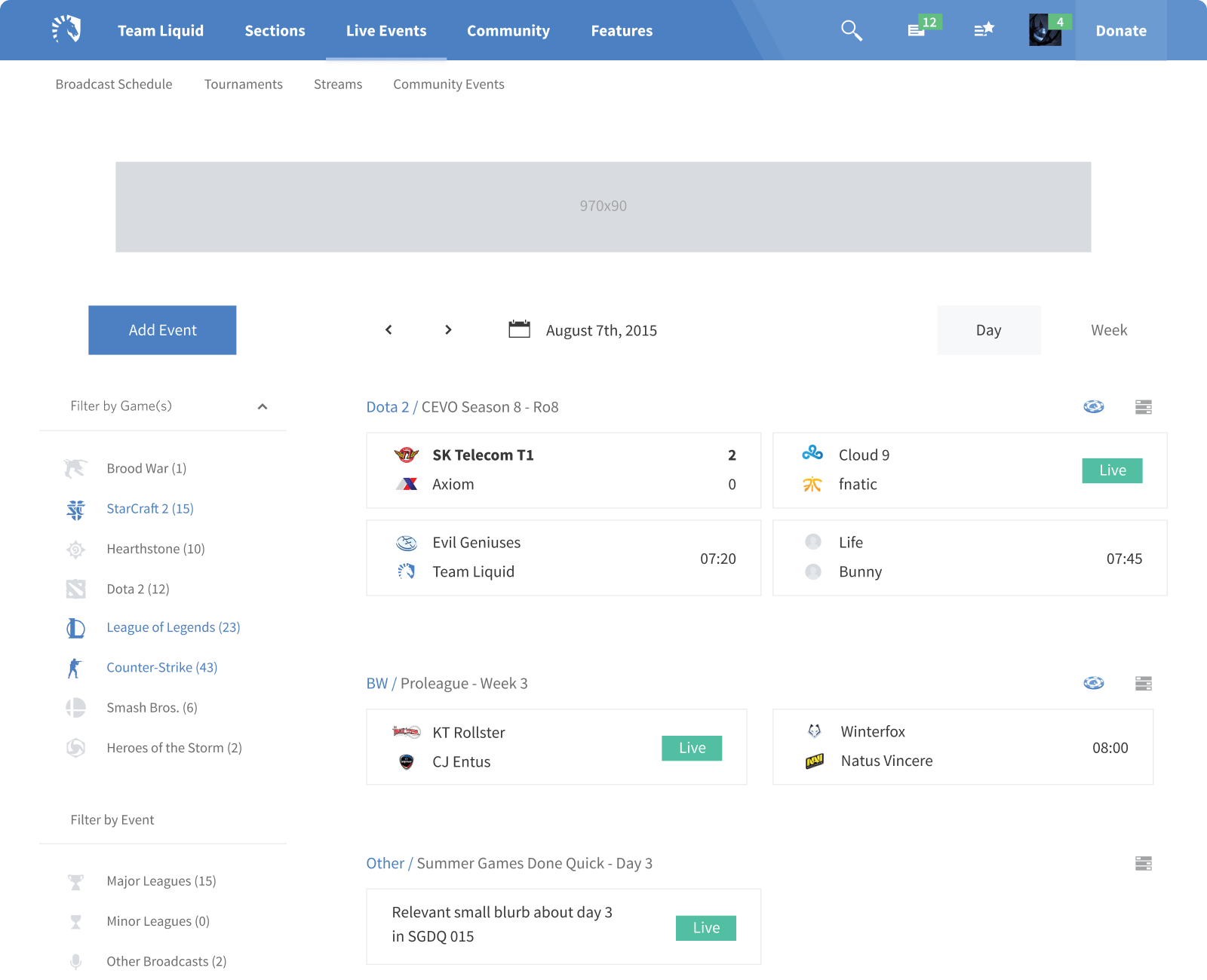
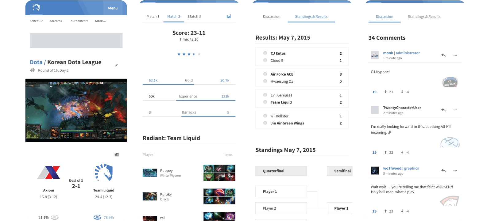
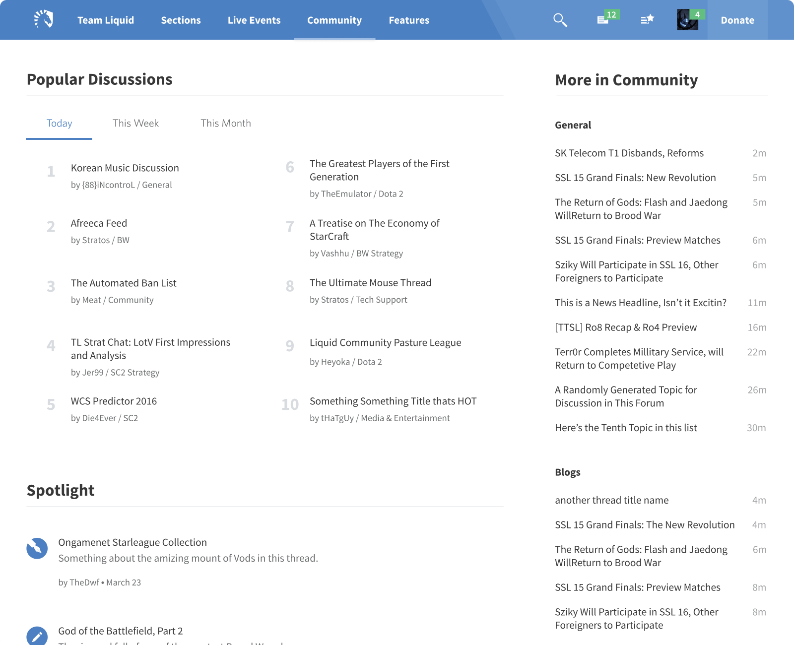
TeamLiquid.net, Version 2

Envisioning the Future of Esports Communities

Table of Contents
  1. Growing Interests and Growing Pains
  2. Proposing a New Vision
  3. Research Articulating the Right Approach
  4. Design Challenges
    1. Crafting Structures to Surface Needs
    2. Expanding the Ability to Keep Up with Discussions
    3. A More Comprehensive Event Experience
  5. Not Shipping, and Next Steps
  6. Final Thoughts

Growing Interests and Growing Pains

How do you stay competitive in an industry that’s experiencing a massive shift in its overall landscape? With new games driving interest in multiple titles, new technologies helping fans to tune in more easily, and new platforms changing the way we socialized around these games, esports was experiencing several massive changes in the 2010s.

A timeline of major releases. Team Liquid in 2000 and then Smash Bros, League, StarCraft 2, Twitch, Counter-Strike:GO, Dota 2, Hearthstone, Rocket League, Discord, and Overwatch — all between 2008 and 2016.

This rapidly changing landscape created a number of problems for Team Liquid’s community projects which were struggling to keep up:

  • Limited resources made it difficult to develop projects to keep up with new interests.
  • Satisfaction and growth was receding due new competition and an overall poor user experience.
  • The codebase was practically unmaintainable, adding difficulties to everything.

Users also had a number of increasing frustrations/challenges with the community experience:

  • Splitting game communities into separate websites made it hard to keep up with the every esport users were interested in. It also
  • Degraded the close feelings people had as communities became more and more separate.
  • The experience for new users on the community sites was overwhelming. And even with seasoned users, there were lots of mitigation strategies people used to optimize their experience.

It was clear that something big needed to happen in order for Team Liquid to keep pace and stay competitive.

Proposing a New Vision

The overall vision I pitched to Victor was to create a more connected unified experience around the esports experience at TeamLiquid.net. And there were several elements we could leverage to help us get there.

Team Liquid had a vibrant community with strong written esports coverage across many games, and a few products that helped fill in gaps with a fan’s overall experience. And these pieces could be used to solve a few big goals:

  • Unifying Team Liquid’s community websites under one roof making it easier to stay connected to the esports and communities fans loved.
  • Rebuilding the user experience around what the community wanted and needed.
  • Building an esports experience that leveraged all of the great things TL already was doing.
  • Creating more sustainable product work by modernizing the design practice and the codebase.

Apart from the last one, these goals were more realistically “strong hypotheses” that I needed to validate by learning about the community in more detail.

Research Articulating the Right Approach

Building something for a vibrant community that’s been around for more than a decade is very challenging. There are lots of strong opinions about what people need most, and established models around how things are accomplished. This makes any change to the user experience challenging to do successfully.

I knew that in order to succeed, my choices would need to be rock solid. And to enable that, in-depth research would be needed to surface the needs of the entire community. Perspectives from longtime and new users, admins, moderators, writers, and other contributors. And making sure participants covered users from each game-specific website and those who engaged with a varying number of esports (1, 2–4, 5+) to capture everything needed.

Several research insights from various users in the community, shown as social media posts.

Talking with community members was fascinating. And while it took over a month just to distill my research into something useful, it was well worth the effort as the most important things I learned confirmed my suspicions about what the right goals would be for the redesign.

I also was able to uncover several other important themes that would be invaluable in creating a more detailed strategy for what the new user experience needed to accomplish, especially around what people cared about most, and visited most often.

Other Supporting Research

What I didn’t learn from this primary research I tried supplementing with others. And analytics and market research helped a great deal to fill in some important gaps in my understanding: what users were actually doing on community sites, and how other products handled a complex, multi-game ecosystem — in, and outside of esports.

Of course, it was important to keep in mind that this research only articulated what was and not what could (or ideally should) be. But they both helped to surface approaches that could be potentially used to solve our challenges.

Design Challenges

Crafting Structures to Surface Needs

If form follows function, then the biggest challenge I needed to tackle was “how do I organize the new website into a form that optimally helps users with their needs?”

Redesigning the overall architecture was challenging due to the questions I needed to answer:

  • How do you identify or clarify user-goals as themes?
  • How do you integrate all games to allow for future growth, or branch-specific initiatives?
  • How do surface the most important needs for users in the most efficient way?

Thanks to the in-depth research, I had lots of signals that helped to guide me.

The overall information architecture of the project, with three major groups: products, the core needs (news, events, and community), and user needs.

More than anything, users wanted to engage with three things: news and articles, streams, and community topics. Or more broadly, news, events, and community content. And this helped to inform the overall organization of the user experience.

The main section menu and community menu, and the order of items based on user activity and preference.

Users also frequented certain forum topics more than others, helping to organize and place topics within these broad categories.

The most difficult challenge however was in helping users monitor what was happening on TL effectively. Data showed that users overwhelmingly relied on the home page to stay informed. And this told me two things: 1. an overview of many areas of the site was valuable to users, and 2. it also meant that a big portion of the website was not helping.

The new architectural approach, while much clearer and approachable, was going to challenge existing user behaviors by forcing users to adopt a new strategy to finding information. And this was the biggest risk in the redesign:

how do I break apart a single point of surveyal into many, and ensure that each branch is a meaningful piece of the overall experience?

The original (and very dense) home page, broken apart into separate pages covering news, events, and community content.

If each major user journey focused on showing the big picture around what was happening in esports, what was on, and what the community was talking about, breaking up the existing monolith around these needs should be successful once users learned the new patterns. But testing and support systems would be critical to get this piece exactly right.

Expanding the Ability to Keep Up with Discussions

Discussions were the lifeblood of Team Liquid’s community experience, and offered a wide range of content for users to engage with. But this wealth of content also created two big challenges for users:

  • A user’s interest and engagement with topics was highly personal, and varied wildly between any two users. So how could we help them reach the things they loved more easily?
  • As much as interests were more defined, user’s didn’t always know what they would be interested in. So how could they find content they might like that they didn’t know about?

These were challenges users already faced. And while the current experience included some mechanisms to help, I wanted to expand upon those ideas to help users keep up with content more easily. And with the big changes to the overall experience, these new strategies and tools would be needed to navigate a more distributed experience with the same fluency.

Better Subscriptions and Communication

User’s cared a lot more about certain threads than others. And one tool they could use was subscribing to threads they cared about. But the experience was no different than viewing other forum lists, and had a lot of room to grow.

An updated design for a user's post activity (what subscriptions basically looked like).
The subscriptions tab in the user profile, which included all of the main thread features, and links to important parts of each thread.

Changing subscriptions to deliver a summary of “what’s happened since you last visited” created much more value with the feature and gave users a better tool to keep up with the threads they cared about most.

The Notifications window accessed on the events page, showing many updates, including quotes and replies in subscribed threads.

Subscriptions also enabled another solution. While it was designed to enable better communication with users overall, the new Notifications feature could also deliver updates to users about their subscribed threads as a separate mechanism.

Including Favorite Topics

Tackling the more ambiguous problem of “what might I care about”, I explored a few ideas. But none were more useful than curating a users “favorite topics.” Here, users could pick and choose their favorite their favorite forum topics which would then be delivered to them via a disclosable sidebar. And this helped in three big ways:

The favorites sidebar, showing recent activity in the Brood War, Tech Support, and Dota 2 Strategy forums.
  • Users had a dedicated space where they could curate the topics they cared about most.
  • Because of its form, users could also access their favorites from anywhere on the site, maintaining a core desire from the current user experience.

This feature also was the main reason I felt confident about the redesign approach, as it delivered an important capability users wanted, and enabled a significantly less overwhelming informational experience (which was a common concern amongst less seasoned users).

Interests You Didn't Even Know You Were Interested In

These additions to the experience captured discussions and topics that users already knew they were interested in. But this has a way of narrowing the vision of what people will find. And it led to the question:

…what about the topics users didn’t even know they might like?

Two features that already solved this problem: spotlighted posts, and featured blogs.

While featured blogs and spotlighted threads were popular existing features that solved this, I added two new modules to cover other needs that existed.

Two new features helping to surface interesting topics: popular discussions (by day, week, month) and new topics.

Popular discussions and new threads both helped to surface different kinds of topics that might be outside of the visibility of user’s preferences. And it gave authors more ability to get noticed and ultimately contribute to the social makeup of Team Liquid (driving users to engage more deeply with the community).

A More Comprehensive Event Experience

As one of the oldest esports organizations, Team Liquid had already done a lot to support and grow the scene. And event coverage was one part — a highly social activity that included discussions around written pieces, capturing sentiment from the community, tuning into matches, and sharing statistics to drive excitement pre and post events.

An insight visualized as a social post about doing more with event coverage.

While all of these elements contributed, the actual user experience was fragmented and hinted that there was a big opportunity to combine what Team Liquid was already doing to craft a more streamlined and complete experience around competitive matches.

Several important components of the new event experience, including match results, preview articles, polls, Liquibet, game ratings, staistics and brackets, and streams.

My solution was to build an experience that drove people to a single place. The event page. Previously this page was used to embed streams onto TL, but it had little value beyond that convenience. And by leveraging the opportunities we had this page could be transformed into a hub for the event and the social engagement that was happening around it.

The Pre-Event Experience

An important part of a fan’s experience was before the event took place, largely due to the excitement that it generated. And fans wanted to know about and engaged with a number of details.

The main section of the page including a list of matches, and the currently selected match (head-to-head).

Despite the broader framing of an “event” page, everything revolved around who was playing who. And including details about the event’s schedule and competitive statistics was the lynchpin of the page. It also enabled something far more valuable that I’ll cover in a bit.

The event page, showing the live-report discussion, and preview article card.

Discussions around what the community was excited about was one of the most important elements of the site (known as live-report threads). But even before this, preview articles and related coverage helped fans catch up or set the stage for the event.

Two mobile-sized views of the event page, showing betting on each matchup, and a community poll.

There were also a number of community “vibe checks” that users liked to participate in. Polls guessing the results were common. And betting on which team/player would win was a popular feature (Liquibet).

The Standings and Results tab, showing results for the day, and the current standings with a Liquipedia bracket.

The other big element of the “not-live” experience was being able to look up results and standings. And being able to leverage Liquipedia to deliver tournament brackets and event results would be a big plus to the experience.

The Live Experience

Once the event went live users gained access to even more information, and new choices around their experience.

The stream component on the event page, showing available streams for users to watch.

As esports audiences are fundamentally global in nature, fans needed to be able to pick the stream they wanted to watch.

Example statistics from Dota 2.

The biggest expansion to the live experience however was the inclusion of game-specific statistics. This data tracked games as they progressed and let fans experience matches in different ways — like turning off the stream entirely and relying on this data when the situation was appropriate

The event page, highlighting the community rating of game 2 between Axiom and Team Liquid.

Finally, ratings were a small, but important piece of the puzzle. Game ratings and polls were often used to mark games that were of special importance. And while they didn’t help with the pre- or live experience, it was a small but important detail to include to let fans find the best matches that happened.

Three views of the event page, showing each important piece (matches, discussion, and statistics).

Overall this redesign delivered a much stronger and exciting new experience to users by leveraging all the pieces that Team Liquid was already doing around competitive events. And I was excited about how the community would respond to it.

Not Shipping, and Next Steps

Redesigning TeamLiquid.net was a massive project that took many months of work. And unfortunately, life got in the way of my ability to complete the project. So let me talk about what was supposed to happen after I completed the work I’ve shared.

The planned roadmap of the project (community feedback/adjustments in parallel with more research and development planning, followed by development and testing.

Because of the nature of Team Liquid’s mostly-volunteer community (at the time), I wanted to come to the table with a fully fleshed out project. And once we had a good foundation on the vision, start working through it and adjust the approach as I got more feedback around what was working and what could be improved.

Lots of things were on my mind to test here. From evaluating the impact of the multi-site reintegration, to testing favorites and how subscription notifications worked in practice (could they be spammy?), to how well the live events pages met the needs of users. And eventually I would also need to code it too — but that’s a whole other discussion.

Final Thoughts

Despite the outcome of this project, it nonetheless was the biggest step forward in my career and practice as a designer. And even though it didn't ship, the work I did here resonated throughout the rest of my tenure at Team Liquid in a big way.

Back to Top